
You conducted a survey but you want someone else to analyze and report it?
I deliver reporting that ensures you can understand the data you collected and put it to use in ways that serve you.
Quantitative analysis and reporting can be daunting: it’s not only time consuming to do well but also requires making myriad decisions that affect interpretation and understanding.
Cleaning data is the critical pre-analysis step that most of us probably wish we could avoid but would be sunk if we did. You have to decide how to address missing data and what the cutoff is for incomplete survey responses (I usually toss out anything less than 70% complete). This is also the step where you’re making sure that all data are classified correctly as numbers or dollar amounts or whatever your preferred category is. Are you doing counts and percentages or do you want means? There are valid reasons for doing either and they’ll both answer separate questions for you. Last, this is where you check for potential bias in the responses - did someone just select C for every question instead of taking the survey seriously?
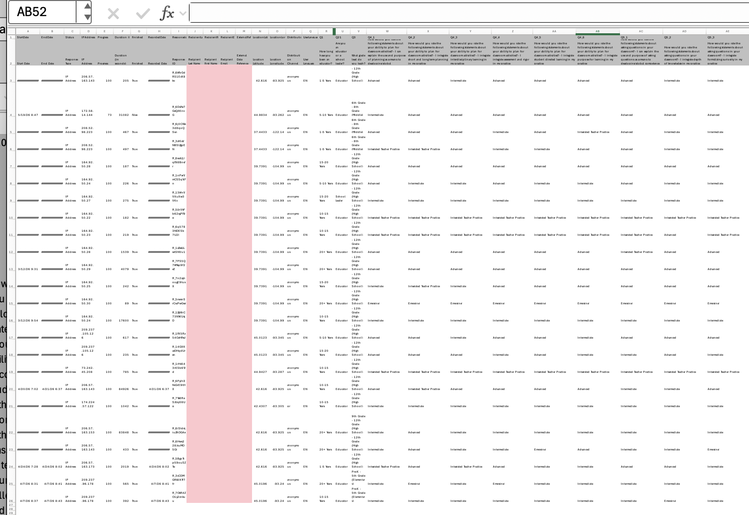
Cleaning is where you set the analysis up for success or frustration.
Quantitative analysis can be as simple or complex as the answers you hope to uncover. The approach needs to be tailored to the questions, though! For basic quantitative analysis, you’re generally looking at descriptive statistics: counts, percentages, means, standard deviations, ranges, etc. These can typically be done using formulas in a spreadsheet, but still require knowing what you are trying to achieve with them and keeping an eye out for irregularities. That’s why it’s important to have a plan grounded in what’s needed, desired, and available. If this is a type of analysis you plan to do more than once, it’s also a good idea to create an analytical template that you can paste the cleaned data into.
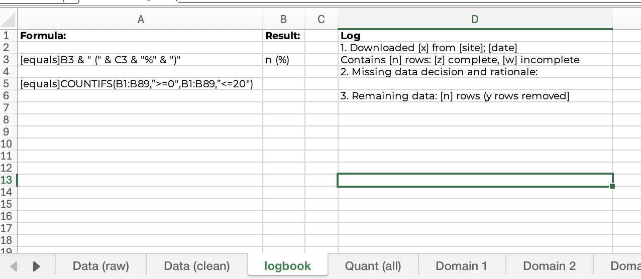
Having a template can simplify your set up and also remind you of the decisions you made last time. If my client uses a specific font, I apply that font to the entire spreadsheet. This simplifies copy/pasting into the report and ultimately saves time.
Interpretation and Reporting go hand-in-hand, working together to answer the questions that led you to do a survey. When I know how a client intends to use the findings, it guides my approach to interpretation and reporting.
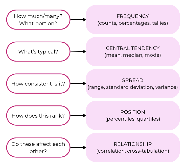
Common Surveys
Employee Engagement
Customer Satisfaction
Training Effectiveness
What we report is only really useful if our clients can access it. One advantage of working independently is that I’m not bound by rigid institutional formatting! Even in a formal report, design choices can highlight important data and clear labeling facilitates understanding. This also saves time for busy readers who don’t have time to pore over every line and cell to spot the patterns and takeaways themselves.
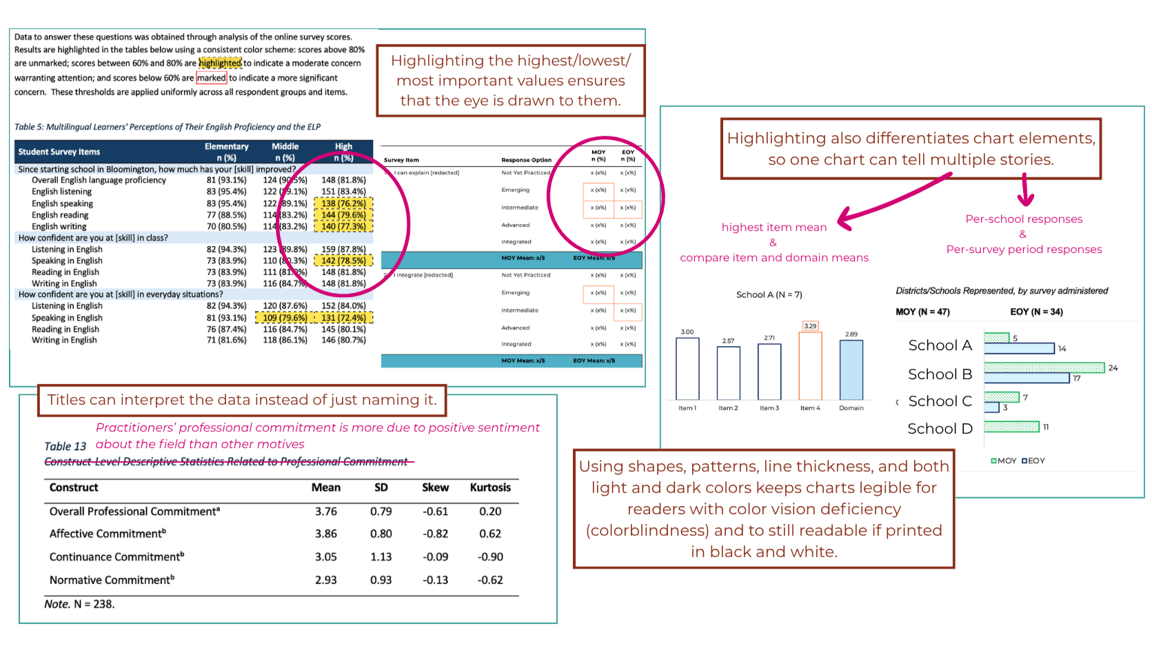
Visual reporting is more than creating a bar chart or pie chart.
When you hire me to analyze and report your quantitative data, you can trust that the deliverable will be accurate, tailored to your preferences, and designed for use.
